



A customer often meets a brand through a small image: a café menu, a product label, or a phone screen. Before reading the details, people notice color, shape, spacing, and contrast. These choices can make a business feel clear and recognizable—or confusing. Visual Art Graphic design is not merely decoration; it helps translate a brand’s values into signals people can see and remember.
Consistency matters. Marq’s 2019 State of Brand Consistency report found that organizations attributed an average 23% revenue increase to presenting their brands consistently. This figure is self-reported, not proof that design alone caused growth. Still, it points to a practical connection: coordinated visuals can support recognition across websites, packaging, social posts, and sales materials. A familiar logo, repeated colors, and readable typography help customers identify a brand when attention is limited.
Small details count. A pale gray label may look elegant on a monitor but become hard to read under store lighting. A beautiful campaign may also feel disconnected from the product it promotes. Graphic design gives teams a way to test these choices against real customer needs, rather than personal taste alone. That work requires judgment, accessible layouts, and feedback from actual use. And yes, some designs miss the mark. That is worth admitting. Brands should review how their visuals perform, refine what confuses people, and keep what genuinely helps them understand the offer. This article explores why visual art and graphic design matter to brands, and how thoughtful choices can build recognition without sacrificing clarity.
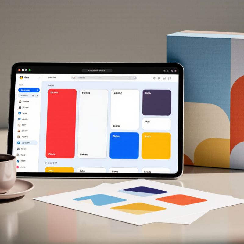
Visual art and graphic design give brand communication a visible voice. They shape how people interpret a message before reading every word. Color, spacing, image style, and typography can suggest trust, energy, care, or urgency. In practical design reviews, a crowded layout often weakens a strong idea. A clear visual system makes meaning easier to recognize across websites, packaging, presentations, and social content.
The Design Management Institute’s Design Value Index reported that design-led companies outperformed the S&P 500 by 211% over ten years.
This finding shows design can support business performance, not merely decoration. However, the statistic is not a guarantee. Its sample and method deserve careful review. A beautiful interface cannot repair unclear positioning or poor service. Visual art must connect with audience needs, cultural context, and measurable communication goals. That connection creates authority because the design feels intentional, consistent, and useful.
Tips:
Define one visual promise before choosing colors. Test the design at thumbnail size. Ask whether the image explains anything. Remove one unnecessary element. Keep accessibility in the brief, not as an afterthought.
Strong design still needs reflection. Some visual choices look impressive but communicate very little.
The better question is simple: can people understand the brand’s meaning quickly, accurately, and comfortably?



Copyright © CUSTOM Building Products 2025
Products | Resources | Interactive Tools | Warranties | Privacy Policy | Terms of Use | Technical Training
